Why are big brands simplifying their own logo?
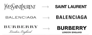
You have probably noticed most of the biggest brands operating in fashion industry are cleaning up their own style and logo. Basically they re-designed their historical distinctive logo by adopting a more linear and reassuring Sans-Serif font. There are mainly two reasons for this revolution (involution?). The first one could be ascribed to the possibility to appear more flexible and being able to easily adapt to new trends and influences, as an empty bucket, for emerging styles and designers. The second one, seems to be originated from the desire to appear more global and less linked to the original dominant white-male-class, which gave the birth to the majority of the luxury European brands. Whatever could be the real reason, we are certainly observing to an erosion of the value originally generated by competent artisans, who were able to realize unique and recognizable brands among all others. Since of medieval age, noble families used to design their coats...